I absolutely love the black and white opening looks with Risa, Maria and Chisato side-by-side. It really grabbed my attention and brought me into the magazine. Another item that caught my eye was the grey organza skirt on Risa paired with the red top. It has such marvelous volume and shape. I'm not completely sold on the overall styling of the look, but the skirt made me take a second look.
I'm just so in love with this cover look. I usually don't spend a lot of time on the table of contents but I just think it looks so pretty.
These little mini capsule type wardrobe spreads are one of my favorite things about Japanese fashion magazines. I love seeing the same items mixed and matched to create different looks. This particular selection is combing pink/white with leopard print and my favorite look is the solo picture with the balloons!
This "Gymnasium Vintage" spread also uses a leopard print item but in a much different way with more muted colors. It's great to see the OP used 7 different ways - sometimes as a dress layered under or over and sometimes functioning as a top or skirt.
Many of these "Pink Kitty" looks seem pin-up inspired to me! I really enjoyed seeing the Verybrain rose skinny pants and the E hyphen world gallery Bon Bon lame camisole used in this spread, especially the coordinates where they're used together. The lilLilly shaggy camisole OP is another piece that stood out for me.
I'm in love with a lot of these Urban Goth looks but my favorites probably have to be the first two, especially the one with the parasol, and the solo picture directly above with the check skirt! Some of the coordinates are more casual like H and K above and some are definitely more dressy and it's great to see that variety. I think I'm going to really enjoy seeing more of these MA-1 type jackets this season.
The photo with Risa and Yui with Tokyo Tower in the background in one of my favorites from the entire issue. It probably has a lot to do with Risa's pose but also the super fluffy jacket and the whole composition of the shot. Grey is actually one of my favorite colors but just not a color I love to wear very often for personal reasons. I think it's very interesting to see how metallic were used with these coordinates too! Another component of this spread that I liked was all the passersby in the background. Yui posted an off shoot photo with the bubble - you can see how many people were around in Harajuku! (Risa also posted a video from the bubble shooting.)
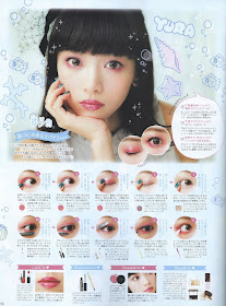
The introduction page for this make up section really drew me in! On a surface level, I just love flow charts like this lmao. It would take me forever to try and translate each box, but I feel like this slightly interactive component just makes the whole thing more interesting lol. I painfully slowly just tried to get through it for myself and I ended up with Risa as my result! The result pages are so beautiful as well. I had to stop and take a moment to stare at Yura's 遊び心のあるスパイス look. I know that the red shadow look isn't for everyone, but it has such a soft yet bold presence.
This Hit Keyword Laboratory spread immediately reminded me of Madoka! If I'm honest, I only watched the series because Liz Lisa was doing a collaboration with them and I wanted to understand the prints and the hype a bit better, but the witch labyrinth scenes just really stand out due to the artistic styling! Sure enough, upon closer inspection, I see that Gekidan Inu Curry is responsible for the Art Direction for this spread! The background is so busy and almost distracting, but the way that the models are incorporated into it is just so perfect. I especially like seeing the pops of red from select coordinates.
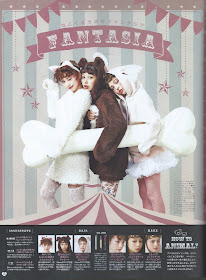
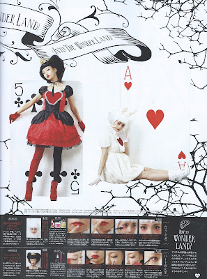
What Oct/Nov issue would be complete without a Halloween spread? It's really interesting to see Larme's take on the holiday and I love the emphasis on the make up part of it. My favorite has to be the Horror Nurse look. There's something so striking about the styling and composition of the image and the red is so stunning.
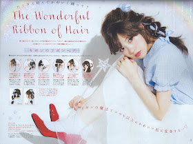
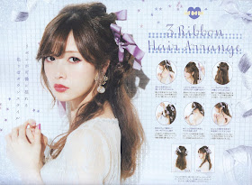
Nothing reads as "classic larme kei" to me more than a ribbon hairstyle and it's not at all surprising to see a complete hair spread dedicated to them in this 24th issue. They changed up the layout a little bit and I love all the different options. I typically fail at getting these to look nice on my own hair, but I'm still excited to try!
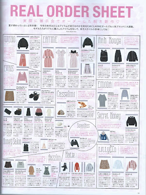
実際に展会でオーダーした秋冬新作 - 夏が終わっていよいよ秋本番。 今年の秋冬はどんなアイテムが流行るのかを知るためにLARMEガールズ&人気ブランドに大調査。 モデルたらがリアルに購入したアイテムを知って、秋冬スタイルの参考にしてね。
The REAL ORDER SHEET is a great reference for the Larme girl when purchasing items for fall and winter! I feel like this would be useful for those who are just getting introduced to the style and also those who are longtime fans! I love the layout they chose for this - it's so easy to understand and the items are even identified in English as well! My personal favorites are the titty&co and Swankiss riders jackets.
Walking through 012 to 023, you can see some of the iconic looks from each issue. You really truly see the aesthetic connection as the magazine grows and it's wonderful to witness.
The content in this issue feels like it was a little less clothes/coordinate-centered than I anticipated based on past issues, but I love the direction they chose for so many of the spreads. If you're interested in seeing more from this issue, please purchase and support where you can! There's so much more content than just the small slice that I've shared and I can't stop gushing about how gorgeous I find the cover. ♡












I still haven't purchased this issue yet but dang this issue looks amazing from what you're shared! Super love the photos shoots and styling - gotta order an issue soon~
ReplyDeleteThere's definitely more to get out of it if you can read the additional stories written in Japanese I think related to the anniversary but still a decent number of pictorials as well!
DeleteHi,
ReplyDeleteThanks for sharing ♥!!!
Loved the Alice in Wonderland inpired shoots. Aw, animal print :3!!! My favorite was Mai Shiraishi's Pink Kitty.
Glad they were useful!
Delete